How to Make Elementor Pages Mobile Friendly (Complete Guide for 2026)
More than half of all website traffic now comes from mobile devices.
If your Elementor pages look perfect on desktop but appear broken on smartphones, you're not alone.
Many website owners spend hours designing beautiful pages only to discover that buttons overlap, text becomes unreadable, and layouts break on smaller screens.
The good news is that Elementor includes powerful responsive editing tools that make mobile optimization much easier.
In this complete guide, you'll learn how to create fully mobile-friendly Elementor pages that look professional across smartphones, tablets, laptops, and desktop screens.
To make Elementor pages mobile friendly, use responsive editing settings, optimize typography, adjust margins and padding, hide unnecessary elements on mobile devices, optimize images, and regularly test your pages on different screen sizes.
📑 Table of Contents
- Why Mobile Optimization Matters
- Common Mobile Problems in Elementor
- Understanding Elementor Responsive Mode
- Step 1: Optimize Typography for Mobile Devices
- Step 2: Fix Padding and Margins
- Step 3: Make Buttons Mobile Friendly
- Step 4: Optimize Images for Mobile
- Step 5: Stack Columns Properly
- Step 6: Use Responsive Containers Correctly
- Step 7: Hide Unnecessary Elements on Mobile
- Step 8: Create a Mobile-Friendly Navigation Menu
- Step 9: Improve Mobile Page Speed
- Step 10: Optimize Hero Sections for Mobile
- Step 11: Optimize Forms for Mobile Users
- Step 12: Test Every Page on Multiple Devices
- Most Common Elementor Mobile Mistakes
- Why Mobile-Friendly Elementor Pages Rank Better
- Advanced Mobile Optimization Techniques for Elementor
- Improve Core Web Vitals for Better Mobile Performance
- How to Reduce Layout Shifts in Elementor
- Best Mobile-Friendly Elementor Settings
- Real Example: Fixing a Broken Elementor Homepage
- Mobile SEO and Elementor
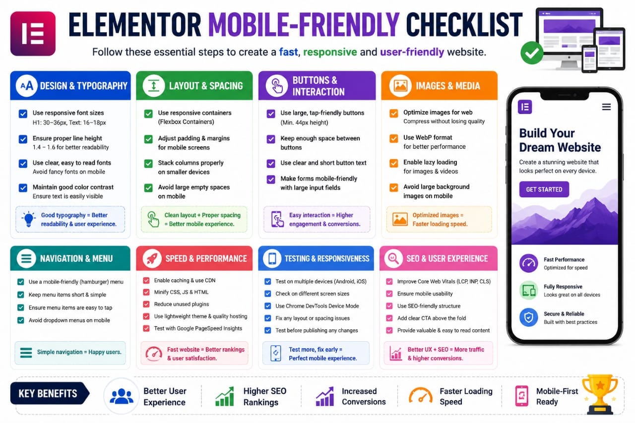
- Complete Elementor Mobile-Friendly Checklist
- Helpful Elementor Resources
- Final Thoughts
- Frequently Asked Questions
- Key Takeaway
Why Mobile Optimization Matters
Google primarily uses mobile-first indexing.
This means Google predominantly evaluates the mobile version of your website when determining rankings.
According to Google's official Mobile-Friendly guidance:
Google Mobile-First Indexing Documentation
If your mobile experience is poor, your rankings and conversions may suffer.
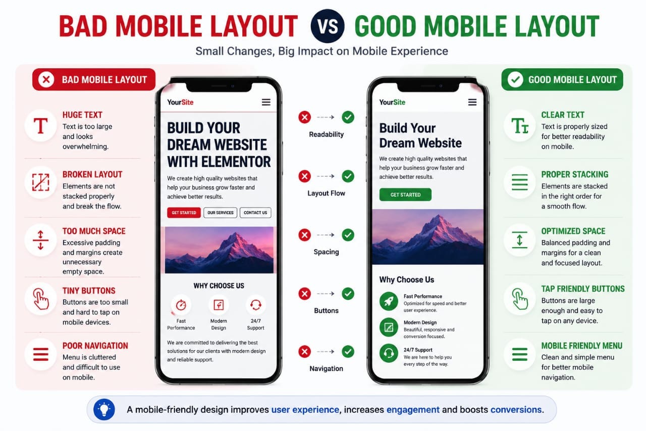
A mobile-friendly Elementor page helps:
- Improve user experience
- Increase engagement
- Reduce bounce rates
- Boost conversions
- Support SEO performance
Common Mobile Problems in Elementor
Before fixing issues, it's important to understand the most common problems.
- Oversized text
- Buttons that don't fit the screen
- Images extending outside containers
- Large empty spaces
- Columns stacked incorrectly
- Slow loading pages
- Navigation menu issues
Most of these problems can be solved directly inside Elementor's responsive settings.
Understanding Elementor Responsive Mode
One of Elementor's strongest features is responsive editing.
You can customize layouts separately for:
- Desktop
- Tablet
- Mobile
To access responsive mode:
- Open your page in Elementor.
- Click the Responsive Mode icon.
- Select Mobile View.
- Adjust elements individually.
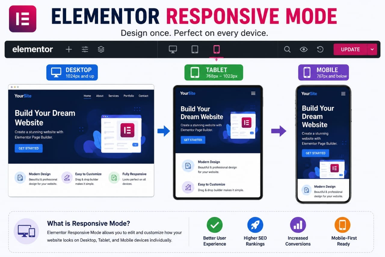
Always design for desktop first and then optimize for tablets and smartphones using Elementor's responsive controls.
Step 1: Optimize Typography for Mobile Devices
Typography is often the biggest cause of poor mobile usability.
A heading that looks great on desktop may appear enormous on a smartphone.
Elementor allows separate font sizes for each device.
Recommended settings:
| Element | Desktop | Mobile |
|---|---|---|
| H1 | 48–60px | 30–36px |
| H2 | 32–42px | 24–30px |
| Body Text | 18px | 16px |
This improves readability without overwhelming smaller screens.
Step 2: Fix Padding and Margins
Large desktop spacing often creates excessive scrolling on mobile devices.
Review:
- Section padding
- Container padding
- Widget margins
- Column spacing
In many cases, reducing padding by 30–50% on mobile creates a much cleaner layout.
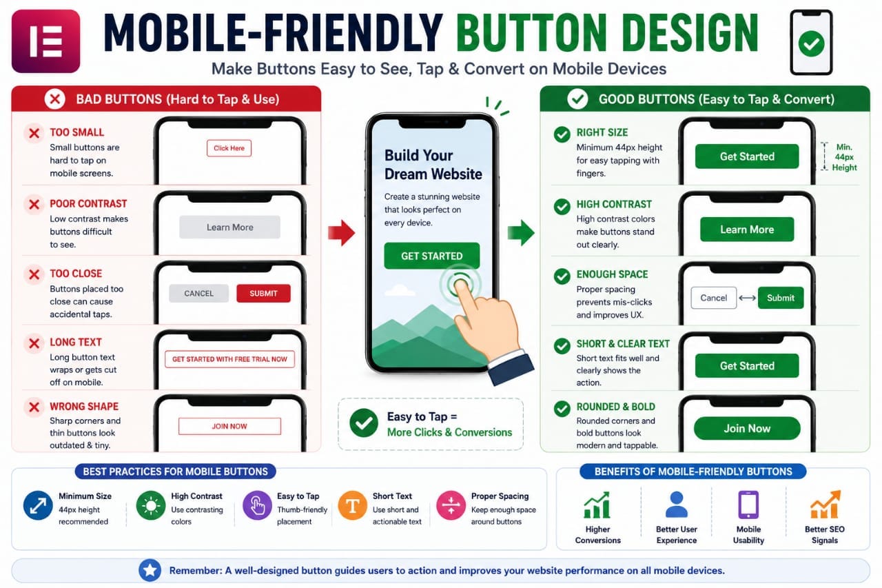
Step 3: Make Buttons Mobile Friendly
Buttons should be easy to tap with a finger.
Google recommends touch targets that are large enough to prevent accidental clicks.
You can learn more from:
Touch Target Accessibility Guidelines
Best practices:
- Increase button width
- Use clear labels
- Provide sufficient spacing
- Avoid tiny buttons
Many Elementor users keep desktop-sized buttons on mobile, making them difficult to tap and reducing conversions.
Step 4: Optimize Images for Mobile
Large images can slow down your website significantly.
Mobile visitors expect fast loading times.
According to the highlighted resource:
Web.dev Performance Best Practices
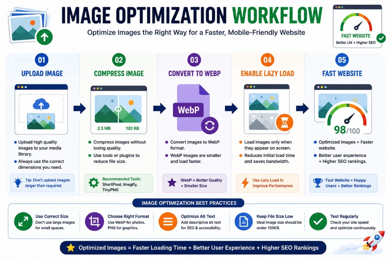
You should:
- Compress images
- Use WebP format
- Resize oversized images
- Enable lazy loading
These improvements help pages load faster on mobile connections.
Step 5: Stack Columns Properly
Multi-column desktop layouts often break on smartphones.
Elementor automatically stacks columns, but manual adjustments may still be necessary.
Review every section in mobile view and ensure:
- Images appear above text when appropriate
- Content order remains logical
- Spacing remains consistent
Step 6: Use Responsive Containers Correctly
Modern Elementor websites use Flexbox Containers instead of traditional sections and columns.
Containers provide much better control over responsive layouts.
Benefits include:
- Cleaner HTML structure
- Faster loading pages
- Better mobile responsiveness
- Greater design flexibility
Elementor's official documentation explains Flexbox Containers here:
Elementor Flexbox Container Guide
If you're still building pages with old sections and columns, consider gradually switching to containers.
Step 7: Hide Unnecessary Elements on Mobile
Not every desktop element needs to appear on smartphones.
Large decorative sections may create clutter and slow loading times.
Elementor allows you to hide specific widgets for:
- Desktop
- Tablet
- Mobile
Examples of elements you may hide:
- Large background videos
- Complex animations
- Decorative images
- Secondary call-to-action sections
Instead of showing everything on mobile, focus only on content that directly helps users complete their goals.
Step 8: Create a Mobile-Friendly Navigation Menu
Your navigation menu plays a major role in mobile usability.
A complicated menu can frustrate visitors and increase bounce rates.
Best practices include:
- Use a hamburger menu
- Limit menu items
- Keep labels short
- Make menu buttons easy to tap
For most websites, five to seven primary menu items are sufficient.
Step 9: Improve Mobile Page Speed
Page speed affects both user experience and SEO.
Slow pages often lead to higher abandonment rates.
You can test your website using:
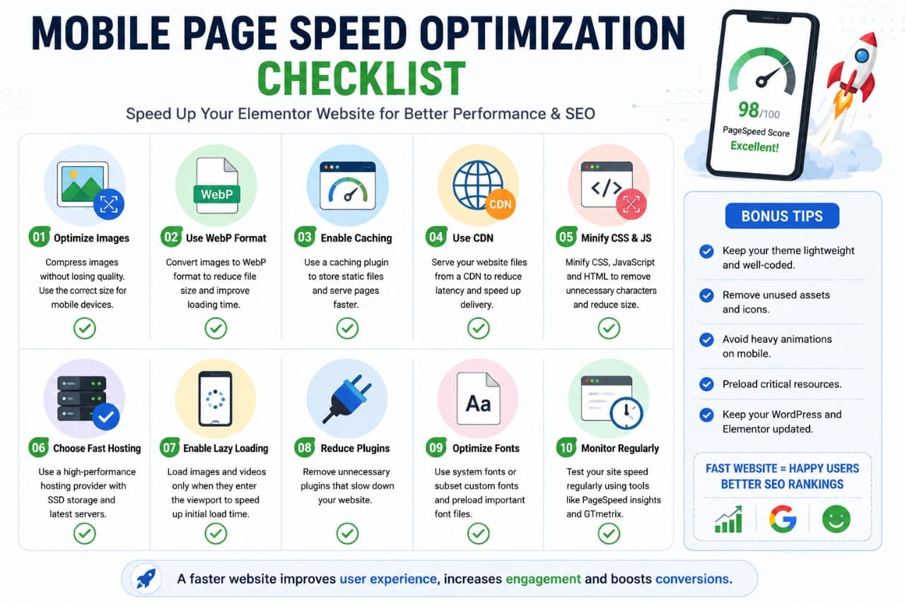
Common Elementor speed improvements:
- Reduce plugins
- Optimize images
- Use caching
- Enable CDN services
- Minify CSS and JavaScript
- Use lightweight themes
Step 10: Optimize Hero Sections for Mobile
The hero section is usually the first thing visitors see.
Unfortunately, many Elementor hero sections break on smartphones.
Common issues:
- Oversized headings
- Large images
- Excessive spacing
- Buttons below the fold
A strong mobile hero section should:
- Display the headline immediately
- Keep content above the fold
- Use one primary CTA
- Load quickly
Instead of a 4-line headline with multiple buttons, use a concise headline, short description, and one clear action button.
Step 11: Optimize Forms for Mobile Users
Forms are often responsible for lost conversions.
Mobile visitors dislike long forms.
Keep forms simple by:
- Reducing required fields
- Using larger input areas
- Avoiding unnecessary questions
- Making submit buttons easy to tap
The fewer steps users must complete, the better.
Step 12: Test Every Page on Multiple Devices
Never assume your page looks perfect simply because Elementor's preview looks good.
Always test on:
- Android phones
- iPhones
- Tablets
- Laptops
- Large desktop monitors
You can use:
This allows you to simulate multiple screen sizes before publishing.
Most Common Elementor Mobile Mistakes
Many website owners accidentally create responsive issues.
| Mistake | Impact |
|---|---|
| Large Desktop Fonts | Poor readability |
| Unoptimized Images | Slow loading |
| Too Many Animations | Performance issues |
| Tiny Buttons | Lower conversions |
| Poor Navigation | Higher bounce rates |
Why Mobile-Friendly Elementor Pages Rank Better
Mobile optimization directly supports SEO performance.
Google evaluates factors such as:
- Page experience
- Core Web Vitals
- Mobile usability
- User engagement
Improving mobile design often leads to better rankings, longer session durations, and increased conversions.
Advanced Mobile Optimization Techniques for Elementor
Once you've fixed the basic responsive issues, it's time to focus on advanced optimization.
These improvements can significantly improve user experience, page speed, and SEO performance.
1. Use Dynamic Viewport Heights Carefully
Many Elementor users create full-screen hero sections using 100vh.
However, mobile browsers often display navigation bars that can cause layout issues.
Always test full-screen sections on actual devices to ensure content remains visible.
2. Limit Heavy Animations
Animations can look impressive on desktop but may reduce performance on mobile devices.
Consider removing:
- Complex motion effects
- Large animated backgrounds
- Excessive scroll effects
- Multiple entrance animations
Use animations only when they enhance user experience.
Improve Core Web Vitals for Better Mobile Performance
Core Web Vitals are Google's performance metrics that measure user experience.
You can learn more from:
Google Web Vitals Documentation
The three main metrics are:
- Largest Contentful Paint (LCP)
- Interaction to Next Paint (INP)
- Cumulative Layout Shift (CLS)
Improving these metrics can help both SEO and user experience.
Compress images, reduce unnecessary plugins, and use quality hosting to improve Core Web Vitals quickly.
How to Reduce Layout Shifts in Elementor
Layout shifts occur when elements move unexpectedly while a page loads.
This often happens because:
- Images lack dimensions
- Fonts load slowly
- Ads load late
- Widgets resize dynamically
To reduce CLS:
- Set image dimensions
- Use optimized fonts
- Reserve space for dynamic elements
- Test pages using PageSpeed Insights
Best Mobile-Friendly Elementor Settings
| Setting | Recommended Value |
|---|---|
| H1 Font Size | 30–36px |
| Body Text | 16–18px |
| Button Height | 44px+ |
| Container Width | 100% |
| Image Format | WebP |
| Hero Section Height | Auto or Custom |
Real Example: Fixing a Broken Elementor Homepage
Let's consider a typical homepage issue.
Before optimization:
- H1 size: 60px
- Large background image
- Three buttons
- Excessive padding
- PageSpeed score: 52
After optimization:
- H1 size: 34px
- Compressed WebP image
- Single CTA button
- Reduced spacing
- PageSpeed score: 90+
The result was faster loading, improved usability, and better engagement.
Mobile SEO and Elementor
Mobile optimization isn't just about design.
It also supports search engine rankings.
Google evaluates:
- Mobile usability
- Page speed
- User experience
- Content accessibility
A responsive Elementor page creates a stronger foundation for SEO success.
A beautiful desktop page won't rank or convert well if the mobile version delivers a poor experience.
Complete Elementor Mobile-Friendly Checklist
Design Checklist
- ✓ Responsive typography
- ✓ Mobile-friendly buttons
- ✓ Proper spacing
- ✓ Clean layout
- ✓ Responsive containers
Performance Checklist
- ✓ Optimized images
- ✓ WebP format
- ✓ Lazy loading enabled
- ✓ Fast hosting
- ✓ Caching enabled
SEO Checklist
- ✓ Mobile usability tested
- ✓ Core Web Vitals optimized
- ✓ Fast loading pages
- ✓ Mobile-first design
- ✓ Clear navigation
Helpful Elementor Resources
For deeper learning, explore these official resources:
Final Thoughts
Making Elementor pages mobile friendly is no longer optional.
With Google's mobile-first indexing and the growing number of smartphone users, mobile optimization is essential for SEO, user experience, and conversions.
By optimizing typography, spacing, images, buttons, navigation, and page speed, you can create Elementor pages that perform exceptionally well on every device.
Remember: a mobile-friendly page isn't just about looking good—it's about helping users accomplish their goals quickly and easily.
Frequently Asked Questions
Why does my Elementor page look different on mobile?
Desktop layouts often don't translate perfectly to smaller screens. Use Elementor's responsive controls to customize mobile layouts separately.
What is the ideal mobile font size in Elementor?
Most websites perform well with H1 headings between 30–36px and body text around 16–18px.
How can I improve Elementor mobile speed?
Compress images, use WebP, enable caching, remove unnecessary plugins, and choose quality hosting.
Should I hide elements on mobile?
Yes, if those elements add clutter or negatively affect performance without providing value.
Does mobile optimization help SEO?
Absolutely. Mobile usability, speed, and user experience all contribute to better search performance.
How often should I test mobile layouts?
Test every major page update and regularly check your site on multiple devices.
Key Takeaway
A successful Elementor website must be mobile friendly first.
Use responsive settings, optimize performance, simplify layouts, and test regularly. Small improvements in mobile usability can lead to higher rankings, better engagement, and increased conversions.